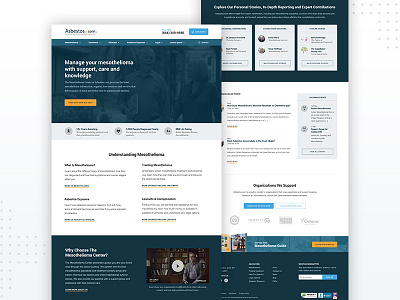
Asbestos Home Page - Desktop
The purpose was to build brand awareness and funnel users to our services and important information. 81% of our users that hit the home page were new users and it was important for us to explain who we are, how we can help them, display strong EAT (credibility), and what mesothelioma is.
The current page explained these things, but not in the right order, and some sections were very poorly laid out. For example, we had a section with some of our services, but we displayed too many calls to action with no level of importance causing high cognitive load. Most of the design also didn’t fall in line with our new design system which I lead the production of. For example we changed a lot of our colors and bumped up some font sizes to meet WCAG AA standards.

