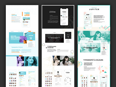
Style Explorations
This is something I did in agency life when I was exploring art direction for a brand. It prevents tunnel-vision on one area (like an app) and allows you to test visual elements as a system.
Committing to multiple different directions encourages you to explore varieties instead of getting 'stuck' with what you think you want at the beginning.
This bad habit also tends to stamp out creativity at a time when you should really be the most open. In other words, "the playful time."
If you view it at 100%, you'll see me define the different directions using personality traits. This is something I recommend my students attempt to develop: tying words to visual elements so they can build their visual vocabulary.
Usually the final direction is a combination of all three and then a little bit extra.
Questions? Ask ⬇️


