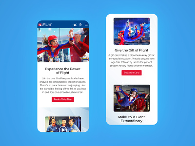
iFLY Mobile Website Redesign
Inconsistent User-focus, poor information architecture, dated design styles and shaky UX plagued the old site. Here are a few mobile screens as I redesigned. Some of this work, along with a redesigned cart experience, resulted in fewer support calls to find key info and resulted in a 22% increase in conversion.
More by Victor E. View profile
Like

