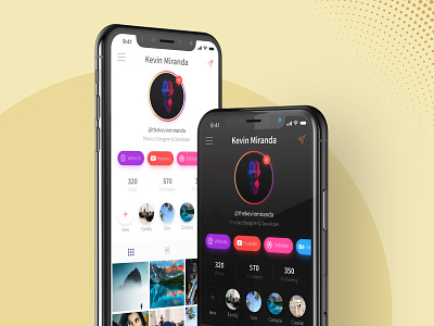
Instagram Redesign Concept - Light + Dark UI
My take on the much awaited dark theme for Instagram.
For the dark theme, the primary color is deep black (and not some shade of grey) which will help save battery on OLED & AMOLED devices.
And as usual, we have a light theme for that clean and minimal look.
Let me know what you think! ✌
Cheers 😊😁
More by Kevin Miranda View profile
Like
