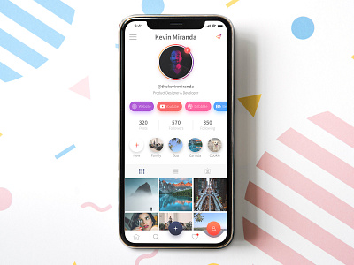
Instagram Redesign Concept - Light UI
Hello there!
For the longest time, I've been thinking to redesign Instagram's UI & UX to make it a bit easier to use and this is the first concept I came up with.
A few extra features I've added include the chips for multiple online profiles like your website, Dribbble, YouTube etc.
All the non-essential CTAs have been moved into the menu shelf which can be toggled from the burger menu button.
Stay tuned for the dark version of the same!
Let me know what you think! 😊
Cheers! ✌😁
-----
All images are courtesy of their respective authors on https://www.pexels.com/
More by Kevin Miranda View profile
Like
