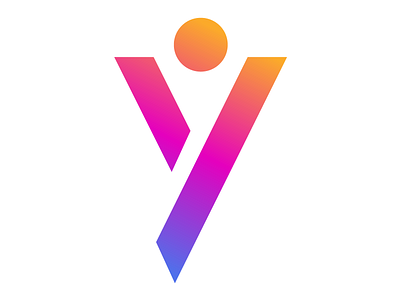
Y Logo - Alphabet 2/26
2/26 - #alphabetlogo 💥 As mentioned in my last post, over the next few weeks I am going to be sharing a logo from each letter of the alphabet, starting with Z and going up to A.
I really wanted to focus on letterforms to communicate that logos don't need to be overdrawn. Simplicity works. Think about the most memorable logos, they're damn simple... Nike's tick, Target's target, McDonald's M.
This logo was a concept created for a youth group by the name of "Yipee". The design utilizes vibrant colors, stencil type and for those more imaginative, a human figure with their arms in the air.
More by Jacob Cass View profile
Like
