Logo design concept- SonicStaff
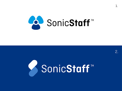


1- Initially, we had a lot of ideas for this logo, but this one stood out from all the rest. The mark is designed in
the simplest way possible that the blue shape looks like a job seeker/worker. Obviously, SonicStaff’s key
motive is to provide flexible jobs to the job seeker/worker and hence kept in primary color i.e blue.
The other 2 elements which are in light green color indicates 2 things simultaneously; the staff and the
two-sided marketplace.
Also, the 3 elements overall represent the 3 verticals; Industrial jobs (warehouses), Hospitality (hotels &
restaurants) and Events.
2- This concept is made keeping in mind the word Sonic, meaning the sound waves that travel at the ultra-fast
speed. Hence this mark is based on the idiom as fast as lightning.
Overall it signifies the speed which your brand enables other companies while hiring a worker i.e instant.
Also, the lightning mark is made in a way that it looks like S which is the initial letter of the brand Sonic Staff.
The two colors, dark and light blue fits very well with the mark itself. Also, it looks good in both lockups, i.e
horizontal and vertical. The logo looks very clean and legible when placed on different backgrounds.
Feedback appreciated
------------
