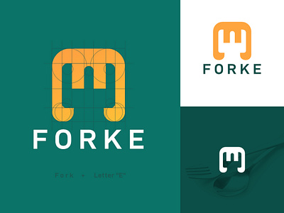
Forke Logo Design Exploration
Simple Monogram Logo with Fork Negative Space and Letter E.
But, after the logo Done, it shown like a King Crown. What do you think?
Currently open for any feedback.
-
➡️ Check for more Work - INSTAGRAM
➡️ Contact me - INGKUTI@GMAIL.COM
More by Ingkuti View profile
Like
