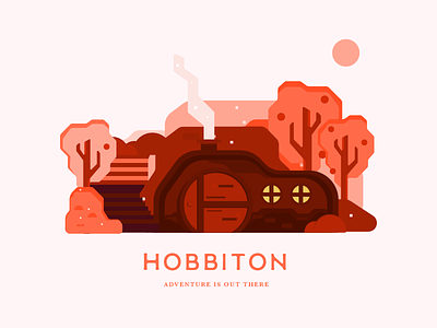
Hobbiton | Adventure is out there
My go at The Shire. I like how the trees turned out and a little adjustment to the color really gave it the pop that I feel I've been lacking in previous illustrations.
.
I also found a much easier way of drawing those nicely curved rectangle shapes to make up the background, trees and overall art style. Quite happy with how the result turned out.
.
The bushes and smaller details could definitely use some more work in terms of adding detail and shadows. And I could definitely go bolder with the colors, try adding a different color even though I like this monochrome look.
.
Overall, I think this one is a good improvement over my previous illustration. What do you guys think? Would love to hear your comments below.
Twitter: https://twitter.com/FarrelNobel
