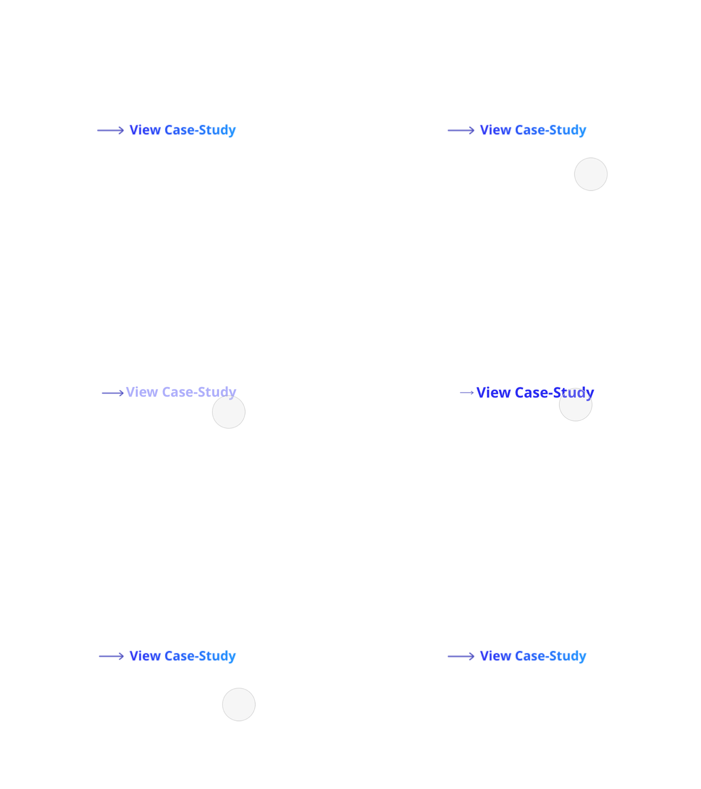
Minimalistic hover state for a CTA
We are fully rebranding our site and I am very excited to share a little part of it - this hover effect.
Most people skim, a very few read deep so we make sure our website copy is:
- Legible
- Readable
- The line of text 50-75 char
- Line spacing 120% - 145%
- Your layout is clean
- Your copy is marginalized into logical and easily digestible chunks
- Most importantly your Call-To-Action buttons >>> clean, noticeable, and large enough for a mobile users.
More by Volha Douban View profile
Like
