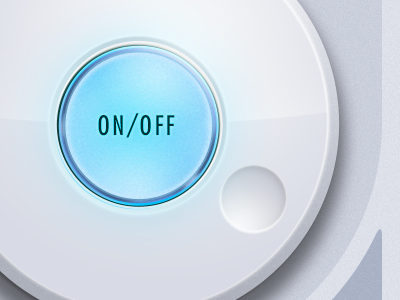
Illuminated on/off - Rebound
What about removing the labels? They seem a little heavy and "on/off" doesn't indicate the current state as much as the color/illumination. I also added a subtle "power" icon. Might not be the right thing, but it is normally used as a toggle symbol (power on/off). Anyway, just a suggestion. Nice work!
More by Francisco Inchauste View profile
Like

