Cookerinoo - Landing Page
UI Design for Cookerino Landing Page
Cookerino is an app that delivers food to your doorstep every week, so you can enjoy a fresh and great quality meal every day without having to waste any time of your schedule to buy, prepare and cook the meals yourself to enjoy homemade healthy food.
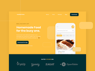
I chose a straight-to-the-point headline clearly explaining the value proposition and added value since this is going to be a landing page that will get a lot of traffic from ads.
Took a screen mock-up from the actual page and place it on the website so users can clearly see how simple and straight-forward the app is, at the end of the day is all about to help you saving time in any way possible. The rounded squared shapes helps the mockup gain more visual weight by creating a clear visual hierarchy on what the user needs to see.
Right after it, I provided social validation to increase the perceived authority by connecting the brand with leader brands on the niche who have given good reviews to the app
Also, this was the first time I get to use an Emoji on a landing page, and I loved it 🔥.
