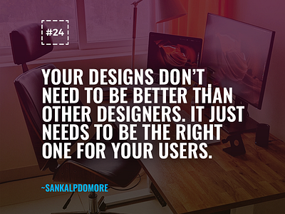
Anti-dribbble shot
In the age of Dribbble, a lot of us are trying to make our products look perfect vs. work perfectly for the user. This is something I've thoroughly observed in all the products whose design shots are shared on Dribbble. I love looking at these beautiful shots but when I click to check the product (whose shots are being posted), I find that they have bad UX here and there. 🙅♂️
While the product is bare minimum functional, trying to make it look beautiful, I've found that we've started compromising on the readability of the content on these products. Don't want to name-call here but posting it out in the world as a gentle reminder for me and other designers. ⏰
May human-centered design prosper once again. ✌
Share across if you found this quote relevant.
---
Press L to show some ❤
.
Find me on the Internet: Portfolio | Blog | Facebook | Twitter | Instagram | LinkedIn

