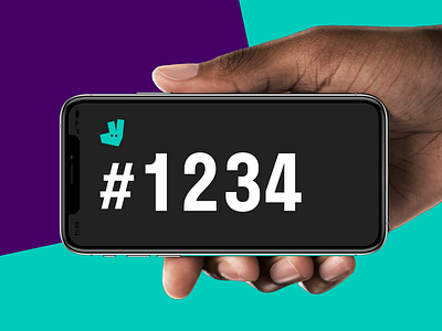
Really Big Order Number
At the end of 2018, we shipped a small fun little feature to riders that's still one of my favorite projects: We call it the Really Big Order Number™.
We'd noticed that when collecting orders from restaurants, riders tended to just show their phone screens to the staff, rather than verbally communicating the order number. This makes total sense, when you consider that restaurants are noisy and busy environments, and both the staff and the rider are often non-native speakers.
That said, while headline-sized, the order number on the collection screen still is not legible from across the room. So we thought — how can we improve this experience? Well, what if we make it really big?
I had a blast exploring loads of different interactions and visual treatments here, but in the end, we ended on something quite simple yet functional based on the following requirements:
- Quick to access and dismiss — Non-essential feature means opportunity for gesture-based entry point. Think muscle memory shortcut, not precise tap.
- Considerate of its environment — A bright white screen would be a blight in a dark restaurant. A black background allows the important information to shine.
- Recognizably Deliveroo — Many restaurants work with multiple delivery partners, so they need to know that this is a Deliveroo order.
Since this was intended as a shortcut for power users, we weren't expecting huge numbers right away — so we were absolutely blown away by how quick the uptake of the feature was, and how frequently riders started using it off the bat. Now few things make me happier than spotting a rider flashing a Really Big Order Number to restaurant staff. ✨

