Insur-Ant-s ... sorry
Exactly what some clients business offering is and how to promote it to the marketplace is harder to pin down and express in some cases than others. Especially when the subject matter is highly complex and somewhat intangible. In these cases it's often about grabbing peoples attention rather than creating a visual campaign that explains everything on first sight.
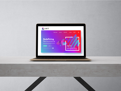
ANT Tech aims to lead the development of systems to the specialty insurance market. They are redefining insurance systems and processes that have become antiquated, streamlining them to create a better process that ensures they can offer their products in the simplest manner to the broadest possible audience, whilst maintaining underwriting discipline and eradicating unnecessary cost. However explaining that visually is not the simplest task.
The logo marque itself references the letter A as well as a series of abstracted ant-like forms that can also be seen to suggest connectivity. Beyond that the decision was taken to grab the consumers attention through vibrant abstract forms that suggest progression and innovation, a fresh perspective. The goal: Draw the viewer in and then clearly and effectively explain the product through the copy. Ultimately it's more about an intimated tone than relating to the subject matter specifically. Bring vibrancy and colour to what can often be a grey area.


