Movie Seat Booking App (2/4)
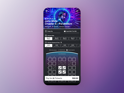
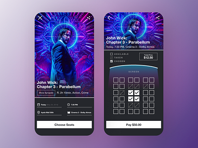
I managed to combine the two screens from my original post.
With this new design, the user would reach their goal in reserving a seat faster and more convenient. No more back and forth checking for how many seats are available.
This layout is also designed based on one's journey of buying a movie ticket:
Choose movie > Choose a city > Choose a mall > Choose a date > Choose desired time slots & cinema quality > Choose seats > Pay for the tickets
I added a number and price with the time slot to preview the number of available seats and also the quality of the cinema (Regular, Atmos, IMAX or Director's Club). There is a "?" button for the users to click if they aren't familiar with the details.
The total price is shown in the CTA button to preview their order.
Planning with designing the home screen and splash art for this app. Then maybe a video to show the prototype. Thanks for reading!
Feel free to press the "L" to leave a like.
What do you think? :)
#Everydays021


