Dytrack Logistics
Hi!
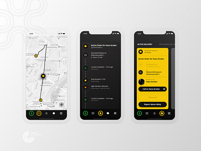
Here are some elements of the driver app design UI (for logistics company) we are working on. Originally designed for a tablet. We agreed with the client to show only mobile screens with basic elements for now)
What do you think about it?
Use case:
Employee wants to see and track the progress of delivery, delivery recipient detailed info, receive notifications from the dispatcher.
User Pain points:
Driver safety is a high priority.
Navigation elements must be easily noticeable.
Hypothesis and solutions:
The testing phase had shown we need to make it in dark colors as a part of the car toolbar. As a safety feature, we have added Voice control (most loved feature for the Drivers, according to survey). Black and yellow colors in the tab bar to provide readability of buttons.
Visit us at
Clockwise.software
