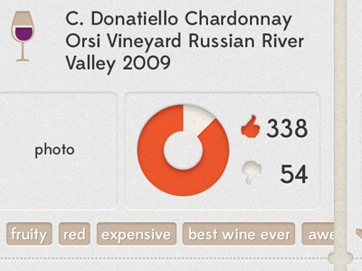
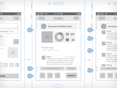
Shindig iOS App Drink Detail
It feels great to finally move on to the UI design now that we're mostly happy with the wireframes.
After playing with what feels like a million different styles, the look and feel is finally coming together! We went dark, and realized it just wasn't fun. We went light, and realized it was way, way too frilly. Now finally I think we found our voice.
Here's a preview of the drink detail page of our app so far. What do you think?
Actual size attached. Critique and comments are appreciated :)
More by Meng He View profile
Like


