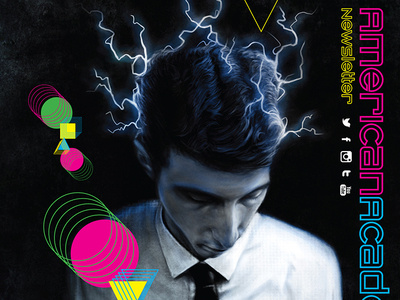
NEWSLETTER REDESIGN
Project: Newsletter Redesign
Client: American Academy of Art
Work: Art Direction, Graphic Design, Print & Digital Design
Newsletter. It sounds old and boring, doesn't it? Often they are poorly designed clip art & stock photos jammed to the edges, fighting for your attention overloads. But they don't have to be.
Call me crazy, but I think for a newsletter to have more impact it should have, less news. The average attention span today is about one second. We need to grab those few seconds we get with color, images and yes, even some copy.
This redesign for the American Academy of Art was to appeal to both prospective students and their parents by showing current and former students throughout the schools 90 year history. And how each artist had fun at what they did and also made a living at it.
Success: The focus on faces, art and color immediately grabbed the viewers attention. Prospects that saw themselves in the pages wanted to know more, therefore more leads were generated.
