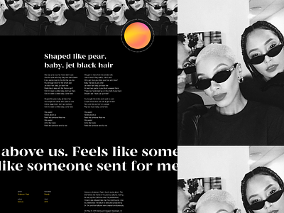
Promo Website for Anderson .Paak’s New LP — Visual Exploration
Hey guys!
How often do you experiment? I’d say that exploring, learning and trying out new things are must-dos if you want to grow as a designer and improve your skills. That’s why today I’d like to share a sneak peek into my recent visual exploration.
Join our Newsletter for more goodies!
What you see above is a promo website for Anderson. Paak’s latest LP “Ventura”. I really loved the album, especially the track called Jet Black, listened to it dozens of times and that's basically where I drew inspiration from. Here's what i did: I took my favorite song, chose my favorite colors and mixed them together in a lovely mesh gradient, and used visual effects and cues I’d been meaning to try for a long time. I went through several options playing around with the grid and composition until I finally came up with the result I could fall in love with.
Let me know if you also fell in love with the composition and overall design or not, and just share your thoughts! Would be glad to hear from you 🙂
Press "L" to show some love!
ᗈ Join our Newsletter!
ᗈ Website
ᗈ TheGrid
ᗈ Spotify
ᗈ Twitter
ᗈ Medium
ᗈ Facebook
ᗈ Instagram


