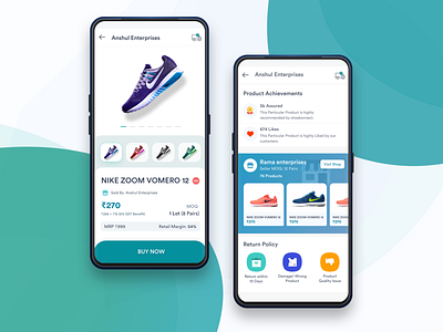
Shoekonnect Product page
Hi Folks..👋🏻
So excited to share the redesigned product page of Shoekonnect APP with you all 🎉
Shoekonnect App is an online B2B wholesale footwear marketplace. It specifically caters the needs of the footwear industry all over India.
We have recently launched our new product page. I worked closely with the buyer retention team and marketing team to identify the problems our users were facing while making a purchase on Shoekonnect.
During the research, we uncovered the following problems faced by our Customers😓😩
1) They were unaware of the type of packaging they will get with the product.
2) They were unaware of the highest selling products
3) Return Policy was not communicated on the product page
4) They were unaware of the retail Margin profit of the product.
5) There was no identification of new products.
Here's the solution we came up with😀
1) We've introduced new product badges to help users discover new products with ease.
2) We added the product achievement section on the product page user can see that section and can make their decision accordingly while making a purchase.
3) We added the return policy section so that our customers have clarity over the return policies and are not worried about the return system.
4) We have added a retail margin of the product so that they can know how. much profit they will get by selling these products in their shop.
5) In the description section, we added new icons of the type of packaging that they will get with the product, Imported product icon is also added to make our customers more clear about what they can expect from the product while delivery.
Let me know what you think about it? Constructive feedbacks are always welcome😇
If you like my shot please hit the L button❤️❤️
Stay tuned for the upcoming UI KIT of the product page 🎁🎁🎉🎊
