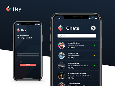
Application Screens - Login & Chat
This is my finished version of the HeyChat Login screen and user dashboard/chat screens.
I chose a very modern approach and decided to go against the brief that requested vibrant colours in the RGB spectrum. Instead, I went with a more neutral navy blue and added a gradient overtop to ensure that depth was being created.
This dark format is also akin to the new trends going around in design lately, from Apple's Mojave OS, to Google Chrome and other applications and software that utilizes a "dark mode" this was the logical step. An inverted colour option can also be used, giving the application a more pristine look overall.
The dark blue gives more character and sophistication to the application, while white would give a more pristine and polished look, it would be too alike the several competitors in the market today.
