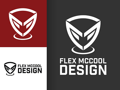
Flex McCool Design Rebrand (Personal Branding Update 2019)
I’ve been dying to redo my logo as something far more appropriate, higher quality, and better reflecting my actual real life identity. This solution keeps the hidden “F”, “M”, and “D” letters in the shield design but the shield also forms a face this time around with video game and sci-fi influences. Really a great fit given my interests. Typography looks cleaner too. Old logo wasn’t aging well and I definitely have gotten better from when I did the original. Final note: this one makes for a mean vertical lockup which I just couldn’t do with my old logo. That is all....
More by Alex "Flex" Shariff View profile
Like
