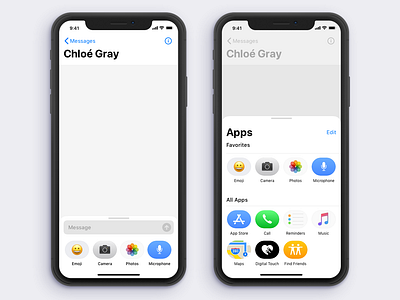
iMessage App UX Redesign
The current iMessage App UX is a mess — I tried to clean up the basic layout in a way that would make it quicker and easier to use all the features. One of the key concepts was to surface every feature into the "app drawer". Whereas in the current version features like camera, dictation, voice recorder and find my friends are scattered around the UI. Here, first and third party features are all in the same place.
More by Ryan Gray View profile
Like
