Design Team Website Experiment
Happy Friday!
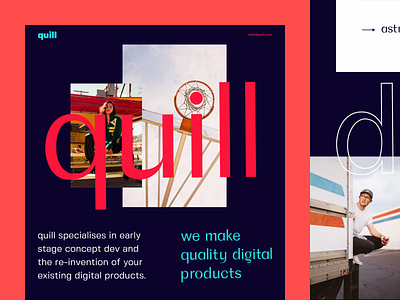
How are you guys? What’s new? I’ve got a little experimental work to share ⬆️. It’s a website for a design team that’s a part of a big studio. Would like to know what you think of that.
Goals In a nutshell, the goal was to create a vibrant and stylish website that stands out and appeals to potential customers.
Approach In order to find the design solution I was looking for, I focused on creating an unconventional composition. I played a bit with the geometry of the layout and used non-standard grid. The combination of bright contrast colors and refined visuals added to the elegance and charisma of the website. The bold typography and its integration into visuals serve as a little twist that catches the eye.
Result Check out the attachment to see the entire page and the result of this little experiment of mine. Don’t be shy and share your thoughts, I’m all ears! 🙂👂
Press "L" to show some love!
ᗈ Join our Newsletter! ᗈ Website ᗈ TheGrid ᗈ Spotify ᗈ Twitter ᗈ Medium ᗈ Facebook ᗈ Instagram

