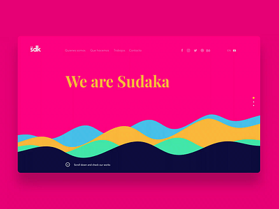
Sudaka wesite
Web developed for what was known as my design studio. My idea was to use only typography, a palette of saturated colors with good contrast and good screen transitions through small animated waves that were in the footer, using images only for the portfolio. The home was an infinite scroll that consisted of 3 parts: a first part with a speech of 3 animated texts, a second one with the highlighted projects, and finally the project gallery.
More by Maxi Malisani View profile
Like


