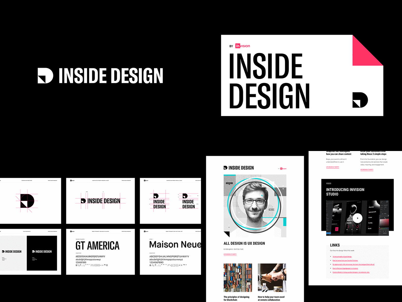
Inside Design Brand Identity
From the archives:
Before leaving InVision last year, I had the pleasure of rebranding the blog, as well as designing the weekly digest's email template. The goal of the redesign allowed InVision to position the blog as a information rich destination that aligned with the mission of providing continuous resources to the design community. The brand mark's D monogram forms a simple page lift that points forward and upward. The typography was inspired by condensed type found in older newsprint and publications that helped headlines stand out and save visual space due to their condensed nature.
____
Do you need help with a new brand identity or rebrand for your business? I'd love to hear from you. Let's talk!
More by Jared Granger View profile
Like
