Best Branding & Identity - FinForce
Behance | Instagram | Pinterest | AliCkreative.com
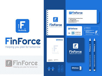
The general idea of the logo is abig “F” letter. The logo was drawn by dropping circles. The lines are tilted at the same 30 to 180 angle to make the logo more pixel perfect, balanced and appealing to human eye. The distribution of shapes is based on the “Golden Ratio” principle, a mathematical sequence that can make design more pleasing and natural-looking.