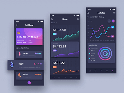
Hangshan Finance App Page Show 01
Hello, this is a rectification of the company's financial project. Many pages are about big data processing and analysis. This design has made a lot of attempts and changes in the color and curve of the financial icon for 2.5D design. The treatment of broken surface makes the hierarchy more prominent and enhances the primary and secondary of the layout. Later, it will continue to sort out. I also hope you can put forward valuable comments. Thank you again for watching!
-
Later I will continue to update my work, 0.0~
More by VisualMaka View profile
Like


