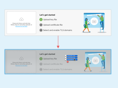
Consolidating the drop zone
Getting the opportunity to iterate in response to user feedback is one of the my favorite parts of the design process. Previously we had the instructions and the dropzone in nearby but separate areas. After running usability studies and observing users repeatedly trying to drop their files into the illustration, it made too much sense not to consolidate the two areas.
More by Fastly View profile
Like

