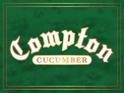
Compton Cucumber Typography
Here's the logo I created for the Compton Cucumber flavor. The arch and lower panel are meant to mimic some of the car club plaques that are displayed in the windows of lowriders. I also fell in love with this street blackletter font. It's great because it doesn't feel as German like another blackletter font I was using. It's got a cool Cali vibe, that I love.
More by Erik Knutson View profile
Like
