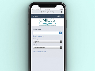
GMILCS
This design addressed the needs of a simplified and effective logo for the GMILCS system (Greater Manchester Integrated Library Cooperative System), and is able to be used across a variety of media both print and digital.
The logo applies theories of negative space, a cool palette, and a modern, sans-serif typeface to communicate an inclusive and welcoming library brand to audiences. Instead of an overly detailed logo, I used a simple open book icon to update the old logo, as well as a fresh color palette.
More by Melody Fulone View profile
Like
