Desktop Reply Actions 🖥
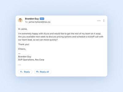
Here is our new reply UI for desktop!
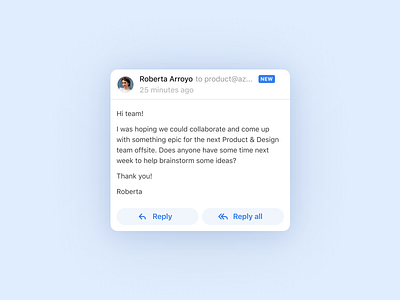
We love it when a small UI enhancement brings a significant impact to our users' workflows. We recently updated our reply/ reply all design on mobile and desktop. Our users used to set a default reply or reply all option, and in the cases where they needed the other, they'd have to find the option buried behind a more menu. We designed two prominent and equally weighted buttons after understanding that our users switched between both actions pretty frequently.
Notice, we still hide our "Forward" option, because in Front,
we encourage assigning and internal comments for less-cluttered, efficient collaboration!
More by Front View profile
Like


