Radient Project
From 2015 through 2017, I had the privilege of working with the radient360 team. During my time with them, I worked on several UIs to help refine their web application.
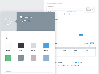
One of my tasks was bringing together their disjointed design styles into one that was constant across all their applications. Originally, they were using over 20 different shades of blue from one piece of the web app to another. I was able to simplify this down to 2. I worked on creating a consistent design language and system that we rolled out to all their apps.
I also created a potentially new dashboard layout that we were in the midst of testing to help improve the user experience and flow. This is the third image in this set. Last I heard this was never finalized and was also beyond the scope of what we originally agreed to.


