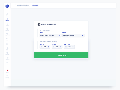
Dashboard Enquiry
This project was the most challenging one for me, technically.
I invested a lot of time, which could have been reduced but I did it anyway because it was the first time that I was building a design system from scratch. For a SASS product. A direct competitor to Flexport.
In no way, it is perfect solution but I tried to perfect each element down to the 8px Grid:
• Textbox height.
• Form Field.
• Sidebar
• Navigational Elements
• Buttons
• Notification Toasts
• Icon's Bounding Boxes
• Active/Hover/Pressed States.
• Page Elements
• Components
In hindsight, I could have done this much later on, and some of it wouldn't even have mattered because as I learned recently from my design boss, the text bounding box is out-of-the-picture when it comes to development.
This particular screen highlights the entry point to making an Enquiry. The objective was to keep it to bare minimum and provide ample cues to the nascent audience who will be transitioning from paper-pencil to actual computer-based shipping enquiries.
