Landing Pages Hero Image
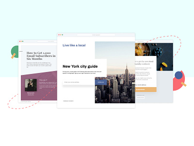
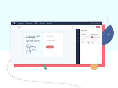
Trying to translate what I did for the header image on the forms page (the shot I've rebounded) to our feature page for the landing pages functionality. These are three of our templates.
It's harder with this one because there is so much going on in the templates themselves that I felt like I shouldn't have a solid offset background like in the forms image, but I still want them to look related.
I also wanted to create mockups that showed diversity in the style of templates we have and in how you can customise them to your branding: I didn't want them to all look like "ConvertKit brand" templates, but I also didn't want the colors to clash with our brand.
I'm a little unsure of the purple on the lefthand template, but when i made it one of our actual brand colors it looked a little too matchy-matchy. 🤷🏻♀️

