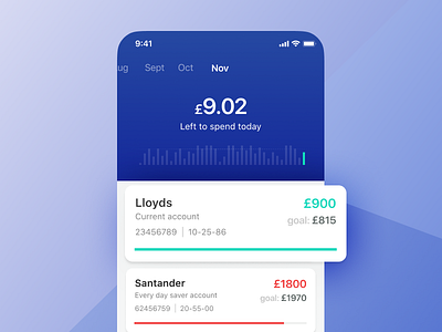
Savings app for the financially savvy – design sprint
3 / 3
While sketching the flow for this digital product we had to ensure each section was fulfilling a primary user need which we had identified earlier in the design sprint.
We were mindful not to cram too much functionality in - too many choices can have a detrimental effect. Studies have shown that too much choice correlates with a user’s unhappiness.
We try to keep things a simple as possible so everyone is 🙂
Show some L if you like the simpler things – how do you achieve it?
More by Caboodle Studio View profile
Like
