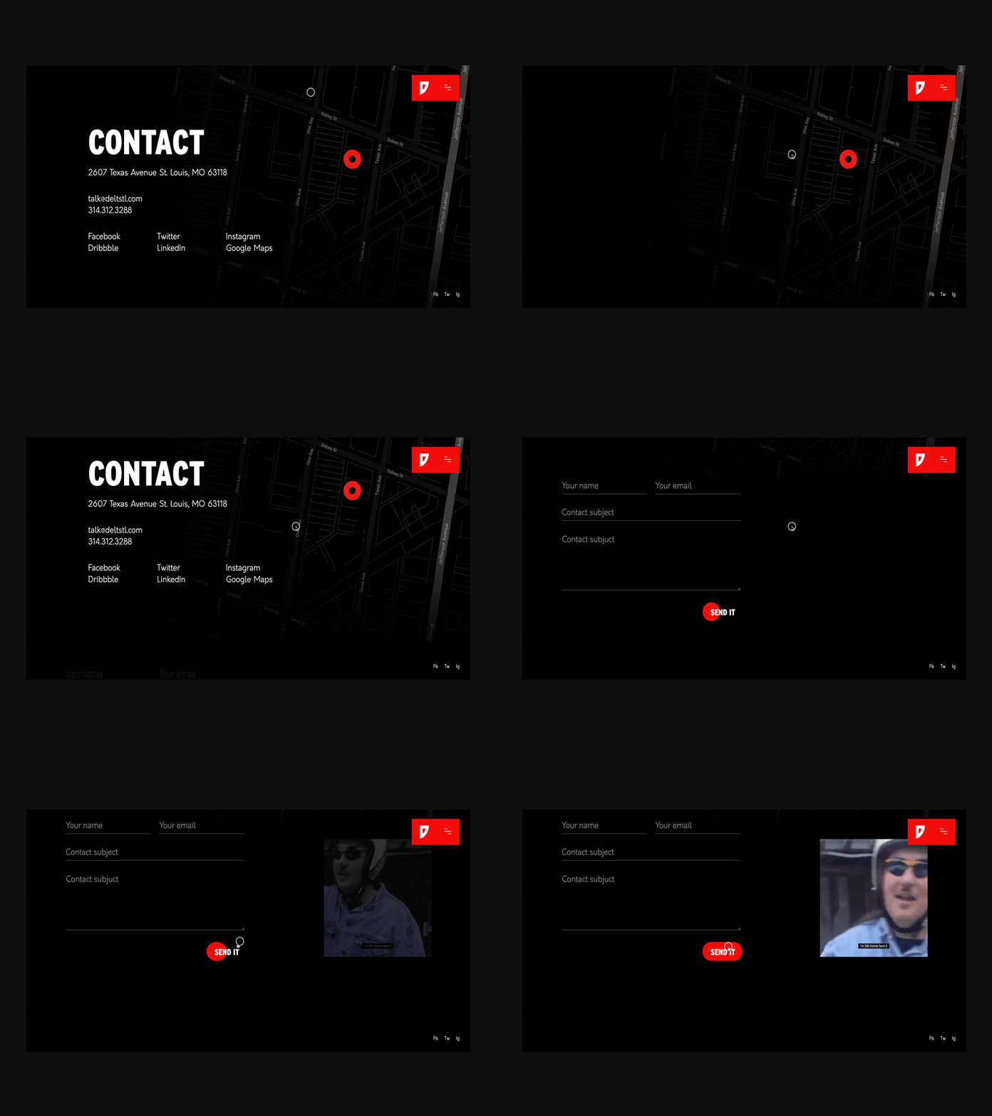
Contact Page Animation
We've been grinding out projects for clients the last few months, but we finally have some time to finish up our rebrand and website redesign.
This is a small shot from our contact page with a dark map background and a nice little hidden feature when hovering the contact button. I just realized the ending got a little messed up when I imported to Photoshop, but fuck it. I'm gonna send it.
We originally had a fully transparent map but saw this shot and added the transparent graident because it looked awesome.
----
Check out more of our work on our Website and Instagram
More by DELT View profile
Like


