Linkedin Home
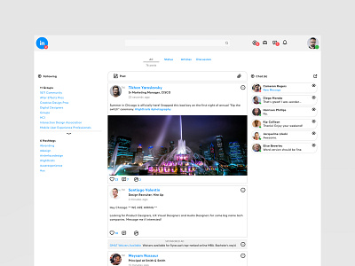

I've been obsessing over this for the last week. Here's my take on a dire LinkedIn refresh. The intent is to make this a true home for professionals: content, connections and conversations.
Working on the profile view, menus and mobile mocks now. More soon!
A few design bites (more details when I post to my website/ case study):
• Kill all the visual pollution. Death to gradients, random color uses and shadows.
• Consolidate the navigation and keep it consistent (top).
• Keep the User's home content focused. Content, connections and conversations.
• All ads are now "promoted" and live in the center with your feed. The right and left rails should be for the user not the advertiser.
• Allow filtering of content. Why do we need to endless scroll?
• Give the user some context has to how many posts they will be scrolling through. Their time is important too.