Betfair Mobile Redesign


Hey Dribbblers, This is a small concept redesign of Betfair's mobile page for a challenge.
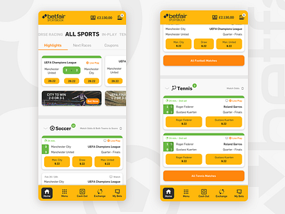
At first attempt, I tried to make things look a bit cleaner and separate better the content using cards, allowing the users to have better knowledge and readability of each current match's info. I also used a different pattern for the betting buttons to avoid mistakes, allowing the users to easily associate the button with the team/player it represents by position in small highlight cards or with captions in larger normal cards. In this first version I've kept most of the original site's UX decisions and systems.
To the final design, I've went to an even cleaner version, giving the user a complete visual focus on betting buttons. In both I applied the brand's yellow color to betting buttons to bond the concept of the brand with betting, creating a connection between the color and the act of betting, so whenever the user thinks of betting, it will resemble to that color.
The final version uses a modified bootstrap4 grid of 4 columns with 15px for margins and gutters.
