Website Homepage redesign

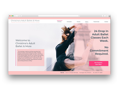
So today I worked on redesigning a website for a local business. I happened to come across it and thought how could I make this better. Some problems with the site include a lack of visual structure; multiple fonts, text sizes, and text colors; colors combinations with low contrast; disorganized content. I wanted to keep as much of the content in tact as possible and better organize it so each piece feels like it belongs. As far as site structure I went a tried and true route thinking of the typical adults who would encounter the site. I did experimented with some layering here and there. I also drew attention to gaining new customers to the business with the call to action. Let me know what you think!