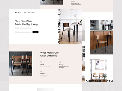
Promo Website for a Truly Good Chair
Hi guys!
Check out the promo website I created to present the SSD chair - a chair that is SIMPLE, STRONG and DURABLE, easy-to-assemble, long-lasting and made with sustainable high-quality materials.
Join our Newsletter for more goodies!
Goals
Creating a clean and minimalist website to match the product’s nature and style, presenting all its advantages and benefits to the world.
Approach
The startup’s mission is to make better furniture: well-designed, well-made and built to last. Their ambition was to design the perfect chair for everyday life while having the least impact on the environment. They built their approach on three pillars: good quality, simplicity and usability, and we followed the same principles while designing the website. We focused on making it informative, stylish and clean, applying smart whitespace utilization, using pastel color palette and playing with the geometry of the layout and geometric shapes.
Results
We ended up with a neat, simple and a bit experimental website design that adheres to the product’s style and originality and speaks to the target audience. This is WIP, so keep in touch, stay tuned and share your feedback!
Press "L" to show some love!
ᗈ Join our Newsletter!
ᗈ Website
ᗈ TheGrid
ᗈ Spotify
ᗈ Twitter
ᗈ Medium
ᗈ Facebook
ᗈ Instagram


