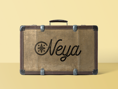
Neya Travel logo
A new rebrand project I am working on. This is one of the concepts for Neya Travel agency. They want a fresh new look keeping the compass as a graphic symbol from the old logo. Soon I will post the winner version too!
Tried that "worn-stamp" effect @Liam Ashurst uses in his work. He shared a quick tutorial how to achieve it in his instagram story. Take a look!
More by Iliana Dimitrova View profile
Like
