FiveThirtyEight's Election Forecast Map Redesign (Full Version)
(Re-upload of the last version, as it was cropped)
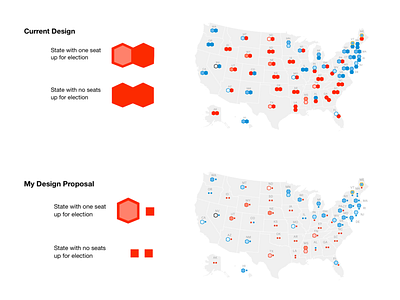
In order to help the user scan the Senate Forecast more easily, the seats that are up for election should be presented in a way that is easily separable from the seats that are not up for election in this election cycle.
Currently, the difference between these seats are only distinguished by the fill of a hexagram used to symbolize each seat. While this difference is easily distinguished when looked at individually. It is much harder for the user’s eye to distinguish between these when looking at the map as a whole.
Exploiting Gestalt laws of grouping could help fix this by changing the size and shape of the seats that are not up for election. This design fix has the seats that are not up for election represented by smaller squares, so the user can focus on the races that are in the current cycle.
