Flip the Script
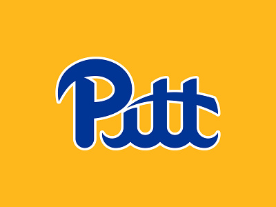
Challenged myself to take a second look at the nostalgic Pitt script.
The mimicking of sloping contours and sharp edges of the panther creates a sort of visual unity between the two marks.
Its geometric structure exhibits more of a clean, sharp and athletic style while still pulling from past Pitt scripts, instilling instant recognition.
Maintaining tradition while unifying a consistent athletic identity.
•••
Note: This is a concept only. This is not part of the University of Pittsburgh.
More by Dylan Winters View profile
Like

