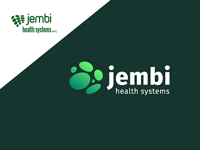
Jembi Health Systems Logo Refresh
When starting at Jembi it was one of my first projects to redesign/refresh our company image to fit the evolution of our company over the last 10 years.
We decided collectively that it wouldn't be a complete redesign of the logo but rather an evolution. So I rearranged the icon elements into a stronger icon, updated the green to fresher tones and gave the actual word Jembi the weight it needed to stand on it's own for instances where "health systems" wouldn't be included.
The aim for the evolved brand was for it be to friendlier, more approachable, modern and hint at the fact that we are African.
If you would like to find out more about Jembi, check out the website: www.jembi.org
More by Bianca Louw View profile
Like
