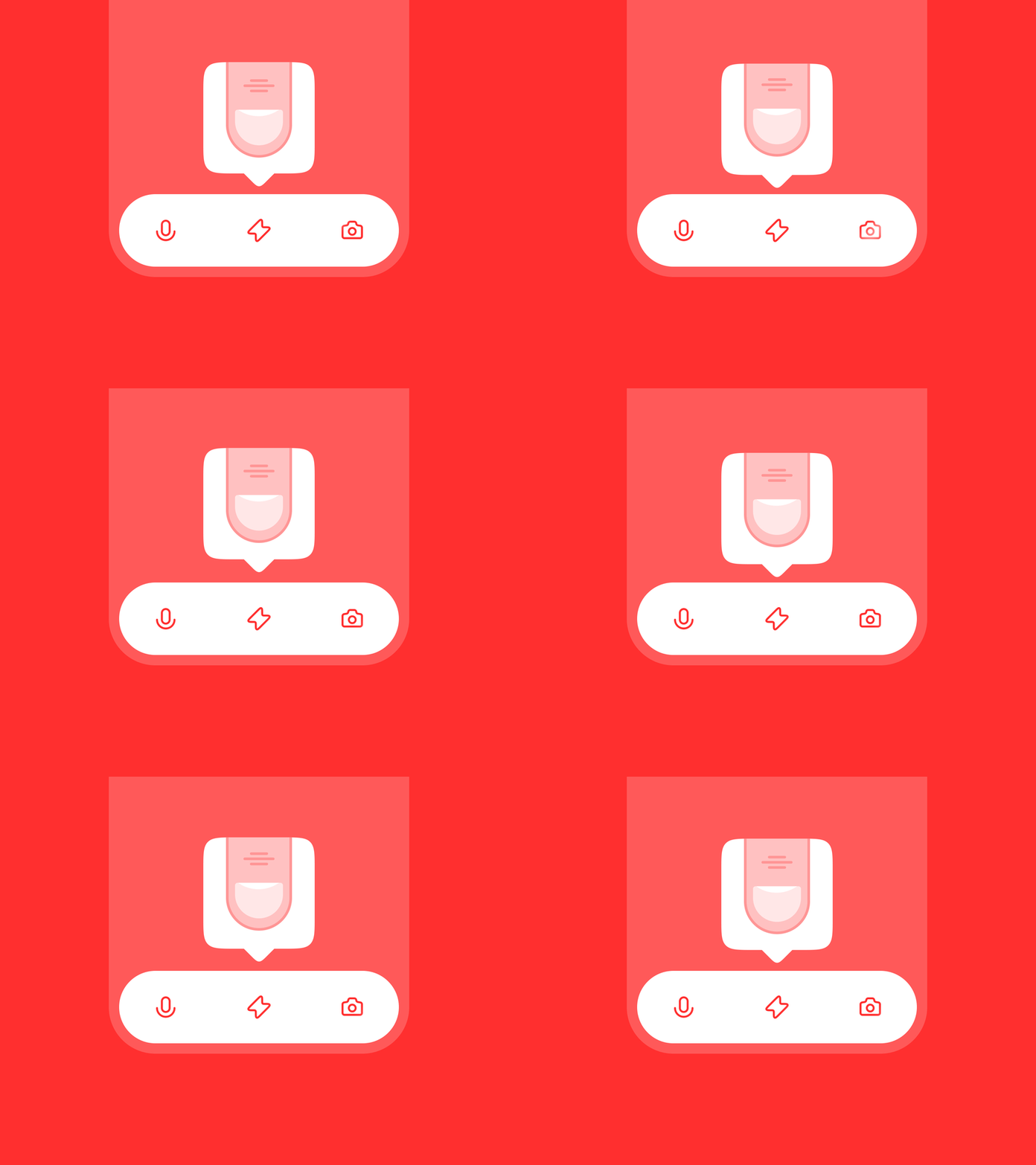
Onboarding Tooltip
When I design I always try to avoid using a text in user interfaces as much as possible.
There is a couple of reasons:
1. Extra work for its localization;
2. Extra work for development. You need to process all edge cases which take place because of a different length of each localized string (“Edit” VS “Редактировать”);
3. Some of your audience might not be able to read. Some of them just don’t like it (Hey gen Z!). You lose your users;
4. Accessibility point. You need to be sure that all your text strings work well on devices with accessibility settings. It’s extra work as well.
So, this shot is an example of the approach.
More by Oleg Frolov View profile
Like
