Updated Design of Myntra Login Page
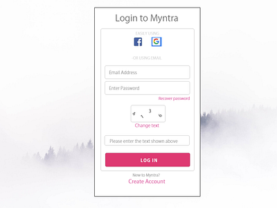
I have tried to made some changes in the existing Login page of Myntra.
1) Instead of whole Facebook & Google word " symbols" would be enough as per me.
2) Two separate blocks for Email and Password and Option "Recover Password" is now right next to the Password text box, making it easier for the user to recover the password incase he forgets.
3) "New to Myntra?" & "Create Account" are now in center instead of being on right bottom most corner.
Feedback is appreciated.
Follow me on Behance & Instagram (Creativelydoit)