Branding and package design for Italian pasta
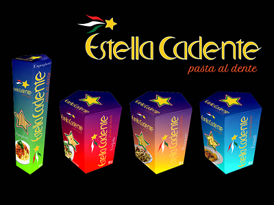
This is a packaging design project for a pasta brand called Estella Cadenta, pasta al dente. Estella Cadente menas shooting star in Italian. The star shap is incoporated into the package design, which is a pentagram with the isotype of the star on top. On the side there is a window shaped as a star to show the contents of the package. I used a dark blue on all packages to emulate the night sky where one would see a shooting star, but each type of pasta is a grandient of that dark blue into another more bright color. Each package has the name of the type of pasta and a suggested picture of preperation. I made all the boxes myself in white carboard used for pasta packaging, and I took a picture of the boxes to make the mock up of the design.
