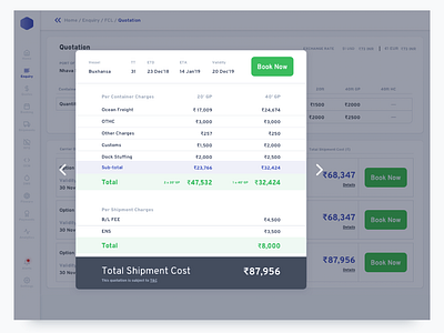
4.5. Dashboard Quote Pop-up
This project was the most challenging one for me, technically. I invested a lot of time, which could have been reduced but I did it anyway because it was the first time that I was building a design system from scratch. For a SASS product. A direct competitor to Flexport.
In no way, it is the best solution but I tried to perfect each element down to the 8px Grid:
• Textbox height.
• Form Field.
• Sidebar
• Navigational Elements
• Buttons
• Notification Toasts
• Icon's Bounding Boxes
• Active/Hover/Pressed States.
• Page Elements
• Components
In hindsight, I could have done this much later on, and some of it wouldn't even have mattered because as I learned recently from my design boss, the text bounding box is out-of-the-picture when it comes to development.
I gnawed a lot of brain time over perfecting the line height for individual sentences and paragraphs.
This particular screen highlights the pricing factor associated with shipping costs. A lot was at play here, navigationally: a user could view the cost of a vessel without exiting the screen.
The real challenge was to brainstorm with the CFO and CEO to figure out the critical information we had to show, without making it bloat.
